How We Built Evexa Around Practical AI Adoption
A behind-the-build look at how the Evexa website explains AI services, builds trust, shows proof, and guides the right clients toward a consultation.

Evexa had a wide offer to explain.
AI assistants. RAG systems. Workflow automation. Custom business platforms. Web and mobile apps. Branding and digital experience.
That kind of range can become hard to understand very quickly. If the page tries to explain every detail at once, the visitor has to do too much work. If the page only says "AI" everywhere, it starts to feel vague.
So the goal was simple:
Make Evexa feel practical, trustworthy, and easy to place in the mind of a business owner or team lead in MENA.
The website needed to show that Evexa can think strategically, design with care, build real systems, and use AI where it helps the business move faster.
The Main Idea
The page is built around one path:
- Understand what Evexa helps with.
- See what business outcomes those services create.
- Trust the team enough to keep reading.
- Explore the services and work.
- Understand the process.
- Ask a better first question through the consultation form.
That order matters because AI services are still easy to misunderstand.
Some visitors arrive curious but unsure. Some arrive with a very specific automation problem. Some know they need a website, app, or internal platform, but they are still figuring out where AI fits.
The page had to serve all three while keeping the offer focused.
1. The Hero: A Clear Promise First
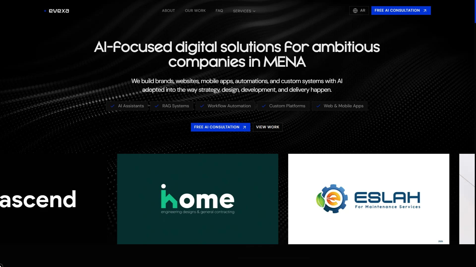
The hero starts with the main promise:
Evexa builds AI-powered systems for ambitious companies in MENA.
That gives the visitor a place to stand. It says who the page is for, what kind of work Evexa does, and where the company is focused.
The supporting copy then makes the promise more concrete. It talks about intelligent assistants, workflow automation, and custom AI platforms. Those phrases matter because they pull the word "AI" out of the abstract and into things a business can actually use.
We kept the first CTA direct: free AI consultation.
That works for this type of project because many buyers are still in discovery mode. They may understand the problem before they understand the correct solution. A consultation is a natural next step because it lowers the pressure while still moving the conversation forward.
The secondary CTA points to the services section. It gives the visitor another path if they want to explore before contacting.
The visual layer uses a deferred AI-style WebGL background and a moving showcase gallery underneath the hero. The background gives the site a technical feel while keeping visual noise away from the message. The project marquee quickly shows that Evexa has real work across websites, platforms, branding, and AI-related projects.
The hero also includes proof chips such as AI assistants, RAG systems, workflow automation, custom platforms, and web and mobile apps. These work like a fast service map. A visitor can scan them in a few seconds and understand the shape of the company.
2. Outcomes Before Features
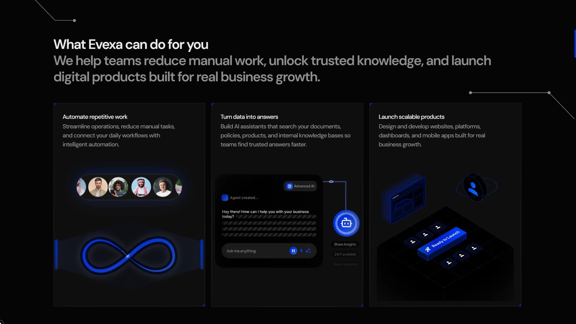
After the hero, the page moves into outcomes.
This section answers a better question than "what do you sell?"
It answers:
What does this help me do?
The three cards focus on practical business value:
- Automate repetitive work.
- Turn data into answers.
- Launch scalable products.
That structure makes sense for Evexa because the company sells more than a single tool. It sells a way to turn business needs into digital systems.
Each card has a Rive visual attached to it. The motion helps the section feel alive, but it still supports the idea in the copy. The visuals are loaded through deferred components so heavier animation work can load after the first screen has room to appear.
On desktop, the cards sit in a clear row. On smaller screens, the section uses a marquee-style flow so the same content stays readable at smaller widths.
The purpose of this section is momentum. Before asking the visitor to read services, the page gives them a simple business reason to care.
3. Trust Early In The Page
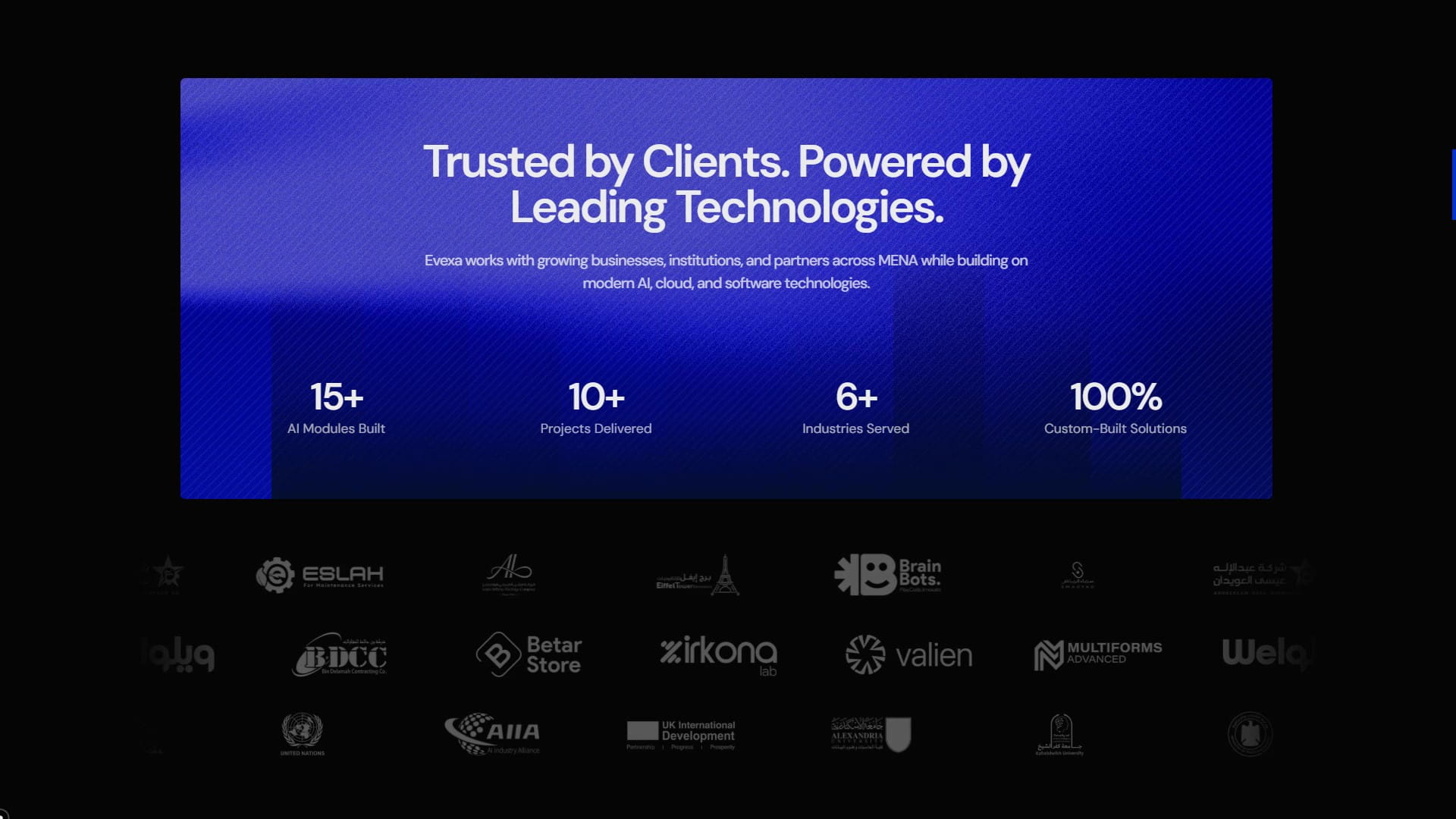
AI work needs trust quickly.
A business often shares more than screens or copy. They are sharing workflows, documents, customer questions, operational details, and business logic.
That is why the trust section appears before the service grid.
The section combines a few proof signals:
- Client and partner logos.
- Simple delivery stats.
- A bold visual treatment.
- A moving logo system for scanability.
The client stats are framed around the kinds of proof that matter for Evexa: AI modules built, projects delivered, industries served, and custom-built solutions.
We avoided making this feel like a generic logo strip. The grain background, striped pattern, and pulse stripes give the section a stronger presence. It feels closer to an intelligence dashboard than a passive "trusted by" row.
The logo rows also support the MENA positioning. They show business, education, public-sector, and partner contexts. That helps Evexa look serious across more than one narrow category.
4. Why AI Now?
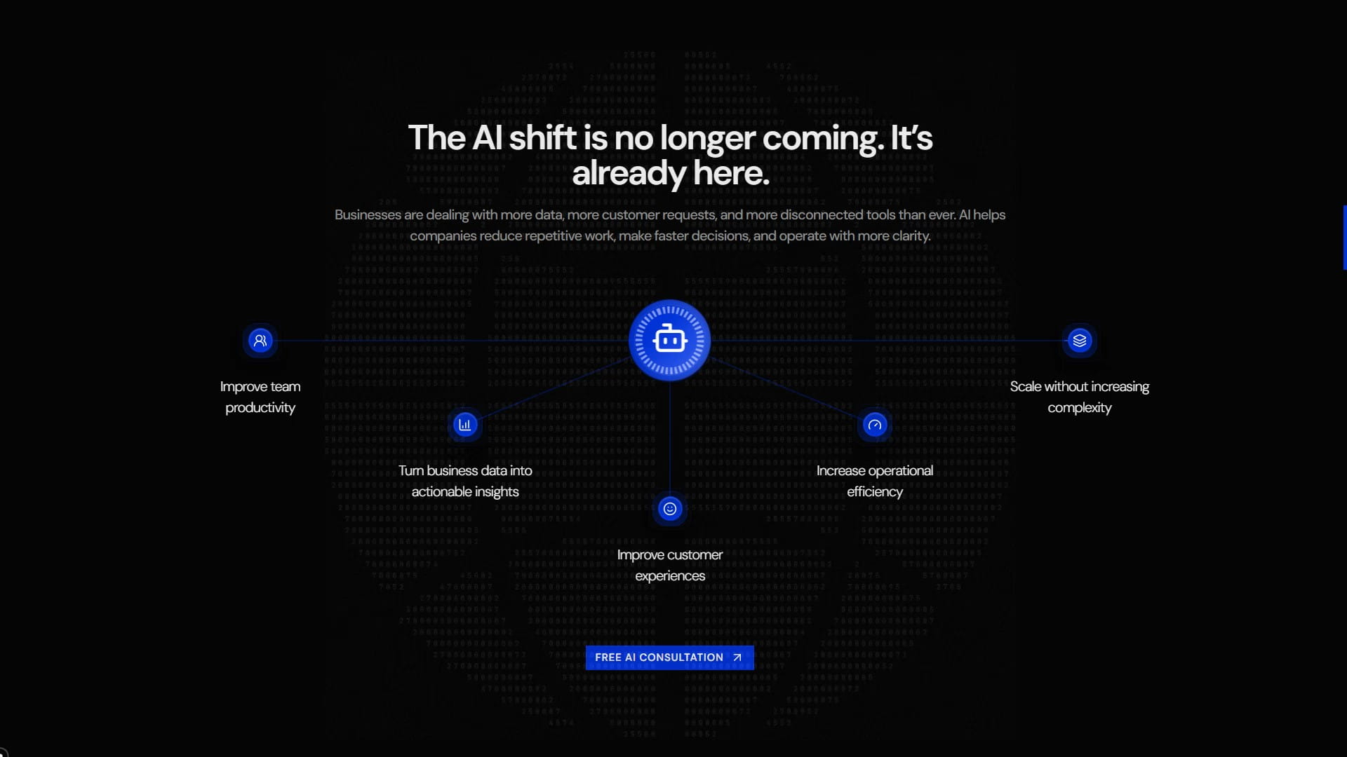
This section exists because many businesses are interested in AI, but interest alone rarely creates action.
The copy keeps the point grounded:
Businesses have more data, more customer requests, and more disconnected tools. AI can help reduce repetitive work, speed up decisions, and make operations clearer.
That is the right kind of urgency for Evexa. The goal is relevance rather than fear or trend language.
The benefits are written as plain outcomes:
- Improve team productivity.
- Turn business data into useful insights.
- Improve customer experiences.
- Increase operational efficiency.
- Scale without increasing complexity.
The Rive graphic adds a focused visual signal, and the section keeps a lot of space around the copy. That restraint matters because the idea itself is already big. The design gives it room.
5. Services Split Into Real Buying Paths
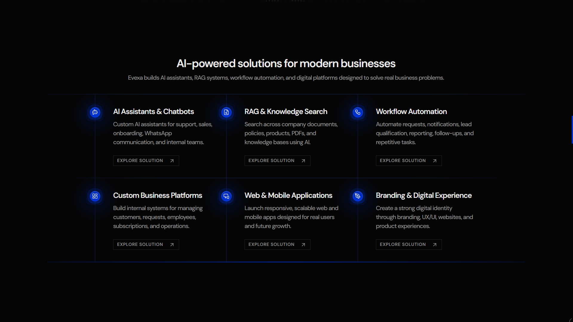
The services section has six main paths:
- AI assistants and chatbots.
- RAG and knowledge search.
- Workflow automation.
- Custom business platforms.
- Web and mobile applications.
- Branding and digital experience.
This split is important.
The first three services are more directly about AI adoption. The second three are digital foundations where AI can still play a role, but the business need may start from a website, app, platform, or brand problem.
That makes the offer easier to understand.
A visitor can keep moving before they know the perfect technical category. They can recognize the area closest to their problem and click into a service page.
Behind the page, those services are handled through reusable service slugs. Each service page can use the same general structure:
- A clear hero.
- Proof points.
- What Evexa builds.
- How AI supports the service.
- Delivery process.
- Contact section.
That gives the site consistency while letting every service keep its own emphasis.
The icons and vertical line treatment also help the grid feel like a system. That visual language fits Evexa because the company is selling structured, technical work. The interface should feel organized before the visitor reads every word.
6. Selected Work As Proof Of Range
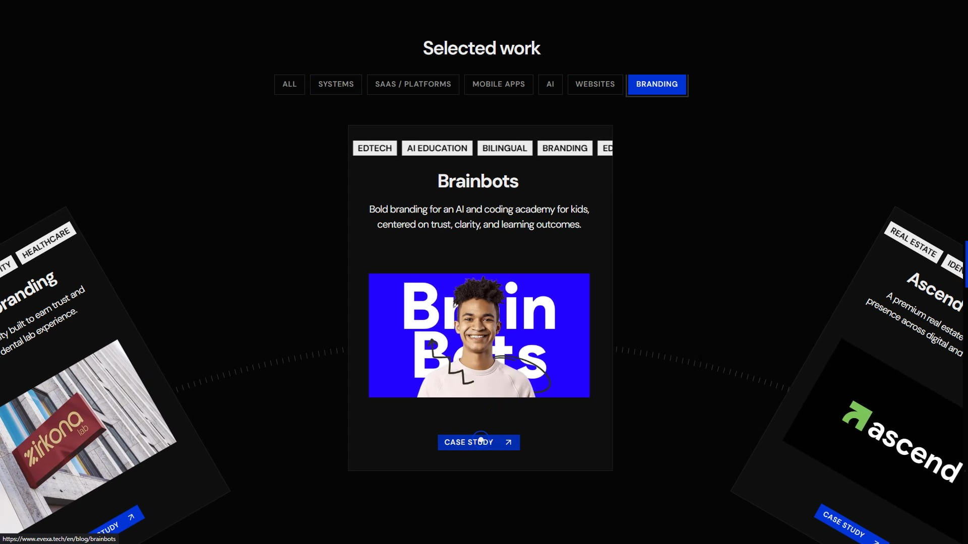
The selected work section has a different job from the trust section.
The trust section says:
These people have worked with Evexa.
The work section says:
Here is the range of what Evexa can shape and ship.
That distinction matters.
For an AI-focused digital solutions company, the portfolio needs to show more than pretty pages. It needs to show software, platforms, AI modules, ecommerce, education systems, corporate websites, and branding.
The project system supports filtering by category, including systems, SaaS, mobile apps, AI, websites, and branding. This helps visitors find the type of work that matches their own situation.
The interactive carousel creates a stronger moment on the page, while the static fallback keeps the section useful while the heavier interaction is still loading. That balance fits the site well: polished where it matters, practical underneath.
Some projects point to internal blog case studies. Others point to live external websites. That gives Evexa room to show both completed public work and deeper project writeups.
7. A Process That Makes AI Feel Manageable
A broad AI project can feel hard to start.
There may be unclear data sources, scattered workflows, security concerns, internal approvals, and a team that has different ideas about what should be built first.
The process section lowers that friction.
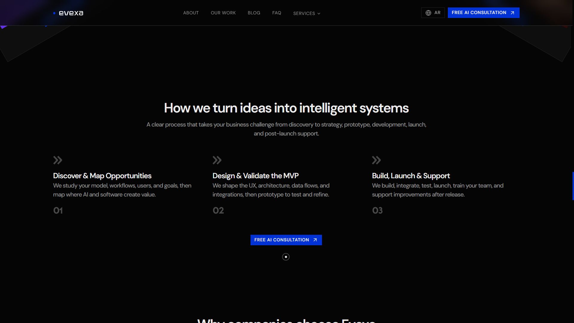
It breaks delivery into three steps:
- Discover and map opportunities.
- Design and validate the MVP.
- Build, launch, and support.
That sequence is simple, but it carries a lot of meaning.
Discovery is where the business model, users, workflows, and AI opportunities become clear. MVP validation keeps the project from becoming too large too early. Build, launch, and support makes the page clear that the work continues through release and improvement.
For mobile, the process cards use a horizontal movement pattern. For desktop, they settle into a clean three-column structure. The section stays compact because process should create confidence and keep the page moving.
8. Why Evexa: The Business Case For The Team
By this point, the visitor has seen the promise, outcomes, trust signals, services, work, and process.
The "Why Evexa" section can now answer a more specific question:
Why this team?
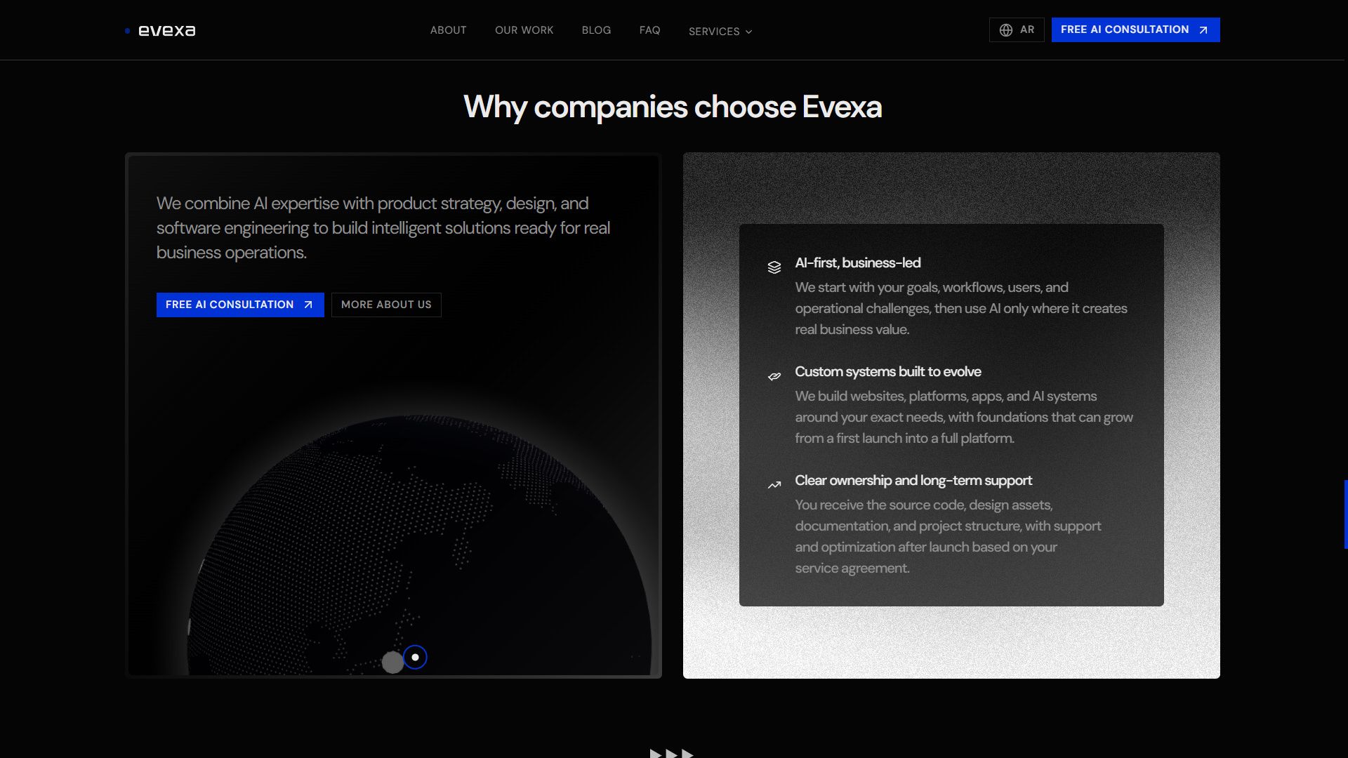
The section is built around three reasons:
- AI-first, business-led.
- Custom systems built to evolve.
- Clear ownership and long-term support.
Those points are useful because they address common buyer worries.
Will the team force AI into the project? Will the system be flexible after launch? Will the client actually own the work? Will there be documentation and support?
The MENA growth globe supports the regional story visually. It uses arcs between Alexandria, Riyadh, and other markets, which makes the regional focus feel present with less copy.
The section also uses a darker, more cinematic treatment. That contrast gives the page a deeper moment before moving into social proof and objections.
9. Testimonials And FAQ Near The End
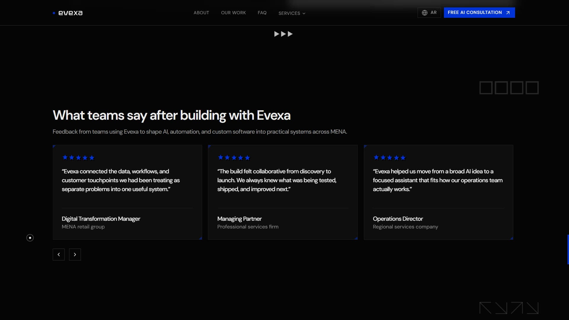
Testimonials work best after the visitor understands the offer.
If they appear too early, they can feel like decoration. Here, they arrive after the page has already explained what Evexa does and how the work is delivered.
The quotes focus on practical outcomes:
- Moving from a broad AI idea to a focused assistant.
- Understanding Arabic and English user needs.
- Making automation easier to explain internally.
- Connecting data, workflows, and customer touchpoints.
- Keeping the build collaborative from discovery to launch.
Those ideas match the exact anxieties the page has been addressing.
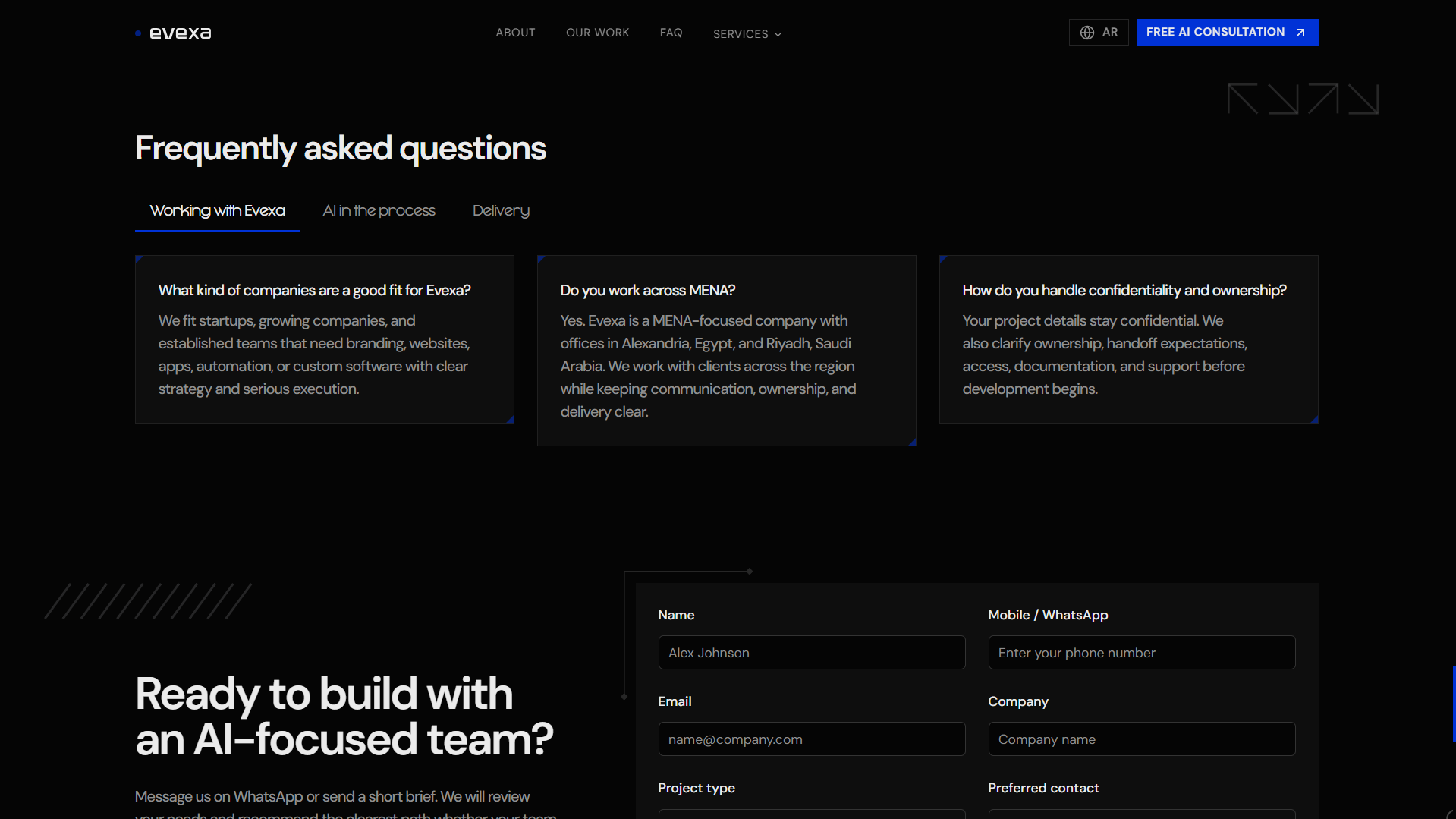
The FAQ section then handles the remaining questions.
It is grouped around working with Evexa, AI in the process, and delivery. That grouping keeps the questions close to the buyer journey instead of turning the FAQ into a random list.
The AI questions are especially important. They explain that AI is part of how Evexa works, while AI features are only used when they improve the product or workflow. That is a necessary line for this kind of company.
10. The Contact Section As A Better First Brief
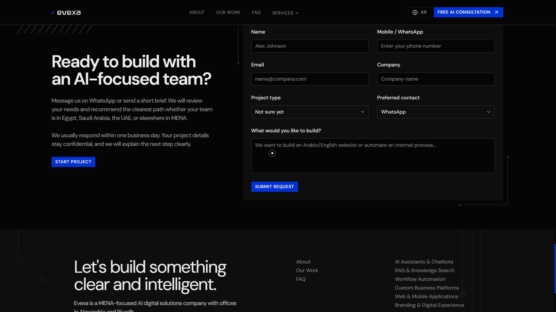
The contact section is built to collect useful context.
The form goes past a name and email and asks for:
- Company name.
- Work email.
- Phone or WhatsApp.
- Preferred contact method.
- What the visitor wants to build.
- The problem they are trying to solve.
- Timeline.
- Budget range.
- Additional details.
That gives Evexa a better first read on the project before the first reply.
The form also supports localized direction and field behavior, which matters for a site serving Arabic and English audiences. Email and phone fields stay left to right, while Arabic content can stay comfortable to type and read.
There is also a direct WhatsApp path. In MENA, that matters. Many serious business conversations still start there, especially when the first step is a consultation.
The form currently validates the intake and prepares the request flow. It is structured so a stronger backend handoff, CRM, or email workflow can be added while preserving the visitor experience.
11. The Hidden Systems Behind The Page
The public homepage is only one layer of the project.
Evexa also has several supporting systems behind it:
- English and Arabic routing through
next-intl. - Locale-aware metadata and canonical URLs.
- Structured service pages generated from shared service slugs.
- MDX blog and case-study content.
- Project data connected to thumbnails, tags, and case-study routes.
- Client document templates for discovery, proposals, SOWs, AI oversight, handoff, support, and change orders.
- Email templates for lead intake, proposals, kickoff, review, launch, handoff, and support.
Those pieces matter because they make the website part of the business system.
The homepage attracts and explains. The service pages go deeper. The blog and case studies create proof. The document and email templates support the work after a lead becomes a real project.
That is the right kind of foundation for Evexa because the company is selling structured delivery. The website should reflect that structure in the way it is built.
The Final Shape
The Evexa site had to make a broad offer feel clear.
The solution was sequencing and restraint. Put the right ideas in the right order.
First, the promise. Then outcomes. Then proof. Then services. Then work. Then process. Then the reasons to trust the team. Then objections. Then contact.
Every section has a job.
That is what makes the page work for Evexa. It turns AI from a big category into a practical conversation about systems, workflows, data, products, and growth.
And for the right visitor, the next step feels simple:
Start with a consultation, bring the real problem, and let the team map the clearest path from there.
.svg)